-
You are currently not logged in! You will have to create an account or login in order to participate on our forums.
You are using an out of date browser. It may not display this or other websites correctly.
You should upgrade or use an alternative browser.
You should upgrade or use an alternative browser.
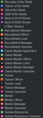
Community Poll on TeamSpeak Icons
- Thread starter Triax
- Start date
jayhz
Jonny Bones Jones
Seems like something you would say, homophobe.Circle voters:


- SteamID64
- 76561198273000972
Snazz
Where's my update?
- SteamID64
- 76561198092854140
The mitochondria is the powerhouse of the cellHow about Myriagon icons?
jayhz
Jonny Bones Jones
We are as divided as ever beforeI think this is the most united the community, staff and execs have ever been kekw
Snazz
Where's my update?
- SteamID64
- 76561198092854140
75% / 25% is pretty good usWe are as divided as ever before
SQUARE PLZZZ +! +!
I'd like to see the old ones back. Old is the new original! :)
yes
Share:


